

Designing a growth feature from zero to launch.
My Role: Senior UX Designer— sole designer on the project and Chipper's first dedicated design hire. Also carried PM responsibilities for the back half of the project
Team: Me, engineering lead, senior engineer, and a VP of Product (until mid-project)
Timeline: Just over 3 months, hard deadline of October 15, 2022
Tools: Figma, Adobe Illustrator, Procreate, UserTesting.com
Outcomes
70% reduction in user acquisition cost
600% growth in monthly visitors
10%+ conversion rate on a brand-new product
Chipper Rewards was a net-new feature built from scratch under a hard external deadline, with the VP of Product leaving halfway through. We shipped on time, and the feature became Chipper's most efficient acquisition channel.
Context
Chipper helps young professionals pay down student loans faster through automated tools like Round-Ups and loan linking. Users kept asking for one thing we didn't have: cash back. Not for themselves, but pointed at their loans.
The opportunity: turn everyday purchases into free money that pays down student debt.
The business goal: increase loan-linking activation and opt-in to Rewards.
The Constraint
The federal student loan repayment pause had just been extended, which pushed back the urgency for borrowers to actively manage their debt. Every month the pause dragged on, the case for a loan-payoff app got weaker. We set a hard launch date of October 15 to get Rewards in front of users before the window closed.
The Curveball
Mid-project, our VP of Product left for another opportunity. Rather than stall, the engineering lead and I split PM responsibilities through launch: I owned scope, prioritization, and stakeholder updates on the design side; he owned delivery. Fewer handoffs and a shorter decision loop meant we actually moved faster in the second half than the first.
Research
Is this a feature problem or a trust problem?
Before committing engineering time, I needed to answer two questions:
Would users value rewards that go toward loans over traditional perks?
What trust barriers exist around linking a credit card to a startup app?
I ran interviews with 8 current users and 15+ non-users who matched our primary persona, plus a competitor analysis of existing card-linked offer programs. I affinity-mapped the interviews to find patterns.
What I found:
Strong enthusiasm for "free money" going toward loans. The value prop landed immediately.
Significant hesitation around legitimacy. People wanted to know who was behind the offers.
Real anxiety about handing credit card data to a brand they'd never heard of.
The design problem wasn't feature clarity. It was trust. That reframed everything that came after.
Key Design Decisions
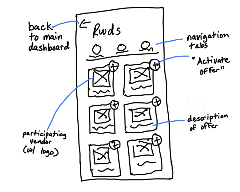
Early wireframe of the Rewards dashboard with all of its requirements
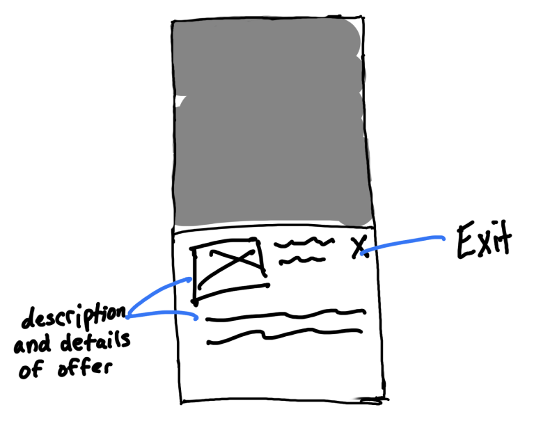
Expansion modal of a particular offer, which offers more in-depth details
Mobile-first MVP
Desktop accounted for less than 10% of Chipper usage, so I designed and shipped mobile only and didn't spend deadline time on a desktop layout.
Trust-first onboarding.
Because research showed card-linking anxiety was the biggest barrier, I built the onboarding flow to lead with security and legitimacy (who Kard is, how card data is handled, what happens to the money) before asking for card info. Ask for trust after you've earned it, not before.
Partnered with Kard for offer infrastructure
Their API gave us merchant offers, transaction matching, and payouts so we could ship inside the deadline. It also dictated a lot of the data model: logo, brand, offer amount, full terms, opt-in vs. evergreen offers, transaction history, and required legal copy on specific screens.
New components for offer display, merchant browsing, and loan targeting
Chipper's existing design system had nothing for a merchant grid. I designed:
An offer card with a fixed logo container so 40+ partner logos of every size and aspect ratio read as a consistent grid
A one-tap "activate" pattern for opt-in offers with a clear activated state
A Current Month / History / Settings structure that reuses the same tab pattern users already knew from Round-Ups
Linked payment account management with per-card toggles, and a targeted-loan setting shared between Round-Ups and Rewards so users only pick a loan once
Reusing familiar patterns on purpose
Rewards sits inside the same navigation structure as Round-Ups. If you knew how to check your Round-Up history, you already knew how to check your Rewards history. Less to learn meant less to distrust.
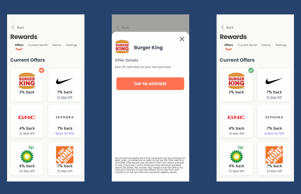
Activation of deal
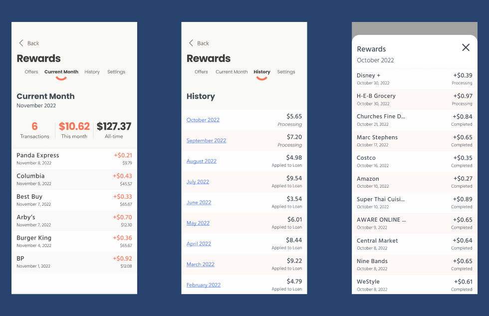
Transaction tracking and history
Usability testing
I ran scenario-based usability tests with 8 participants on UserTesting.com. Results were overwhelmingly positive on the core flows. One issue surfaced: participants couldn't tell when a linked card had disconnected, and had no way to fix it. For a feature that only earns money when the card is connected, that's a silent failure. I added visible linked-card status with an inline "Reconnect" action before handoff.
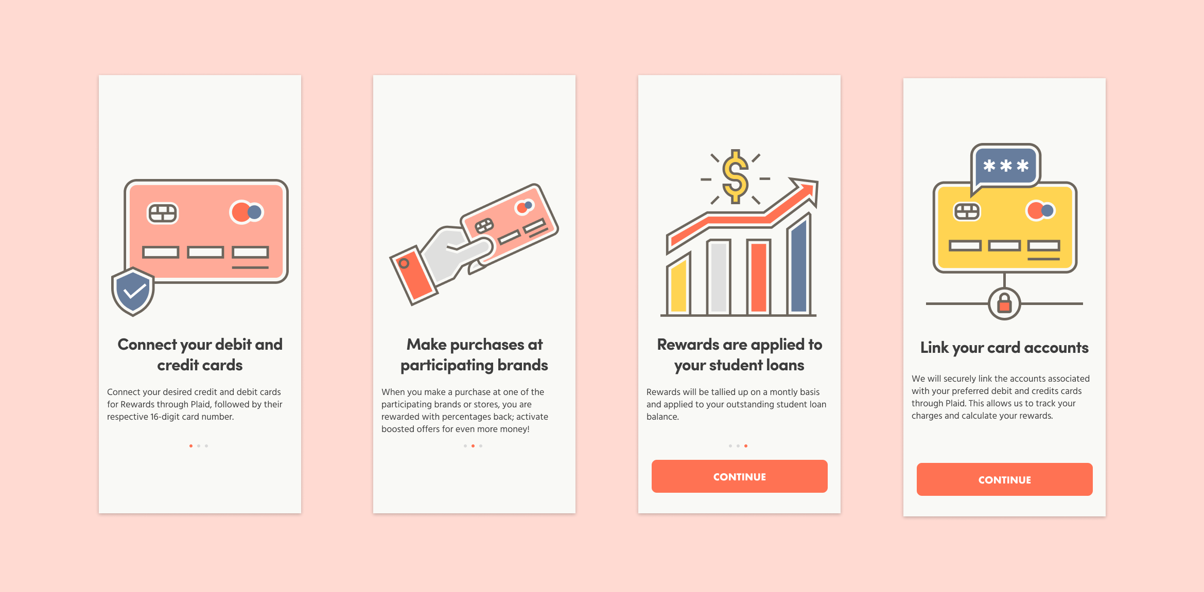
Onboarding flow for Chipper Rewards
Once the onboarding flow was added to the prototype and retested, the results were far more positive and the confusion seemed to be lifted.
Results
Shipped on the October 15 deadline. Over the following 3 months:
70% reduction in user acquisition cost. Rewards became a reason to sign up, not just a feature for existing users.
600% growth in monthly visitors.
10%+ conversion rate on a brand-new product, in a category where users had told us they were nervous about linking a card.
What I Would Do Differently
Run a card sort on the onboarding information architecture instead of relying on interview synthesis alone.
A/B test the onboarding flow rather than shipping one version. We shipped the trust-first flow because research pointed there, but I never measured it against a shorter alternative.