

Chipper is a fintech app leading the way in student loan debt. One of it’s most recent tools is Chipper Rewards, which lets users get cash back on their purchases and apply them directly to their student loans.
My Role:
Senior UX Designer
Tools:
Figma, Adobe Illustrator, Procreate, UserTesting.com
Why Rewards?
Chipper began as an app that would round up your purchases to the nearest dollar and apply that amount directly to your student loans. As success with Round-Ups increased, we were regularly asked if there were any programs to get free money applied to their loans, which eventually led us to our Rewards tool.
I spent time interviewing existing users (and non-users that fit our primary and secondary personas) to validate the desire and usefulness of Rewards. The data that came back suggested that users would highly desire to use this feature.
How does it work?
Chipper partnered with Kard, a credit card processing company that manages participating brands and disperses reward earnings. Because of their well-mapped API, I was able to design our tool to fit our users specific needs.
Iterate, Iterate, Iterate
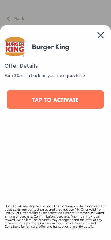
Kard has very clear documentation for their rewards system, part of which lays out the required information that needs to be present, as well as actions that need to be available (e.g. the opportunity to “opt in” to certain offers, as compared to “evergreen”offers that are always activated. My challenge was finding a way to display all of these components in a cohesive way that makes sense to our average user, so I began sketching out some ideas of how this layout would work. Some of these required components were:
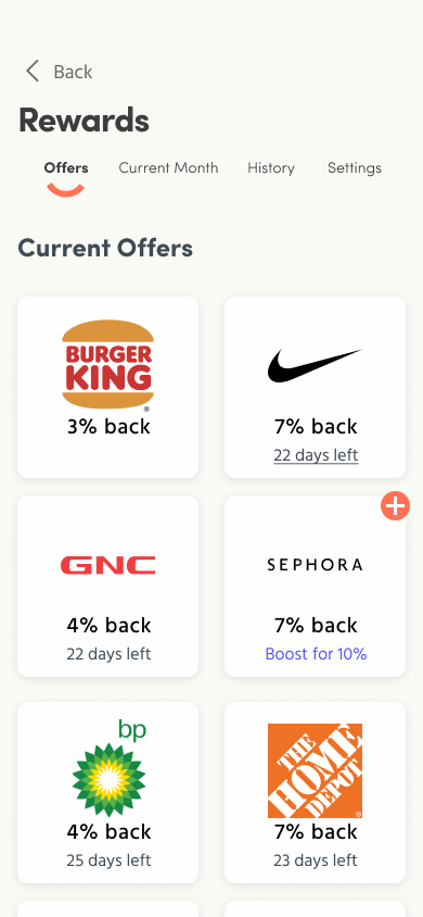
Displaying offers using logo, brand name, and offer amount
A way to see the full details of the offer
Buttons to opt into certain offers
History of reward transactions
Required legal text on certain pages
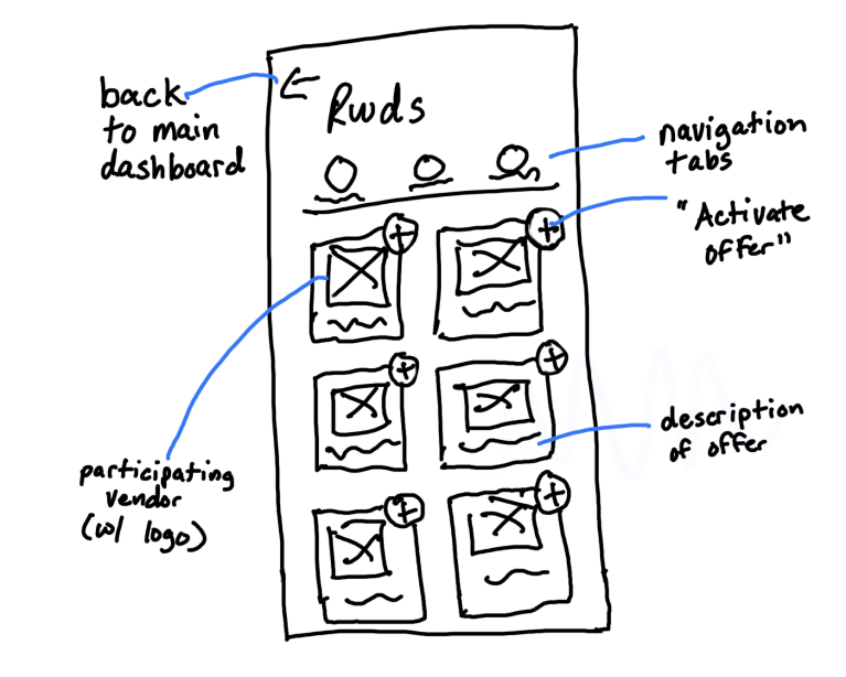
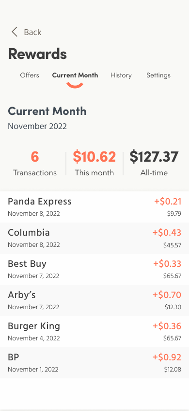
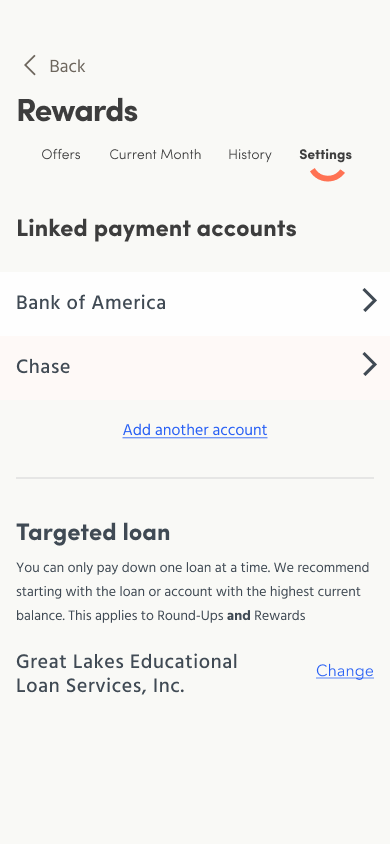
Early wireframe of the Rewards dashboard with all of its requirements
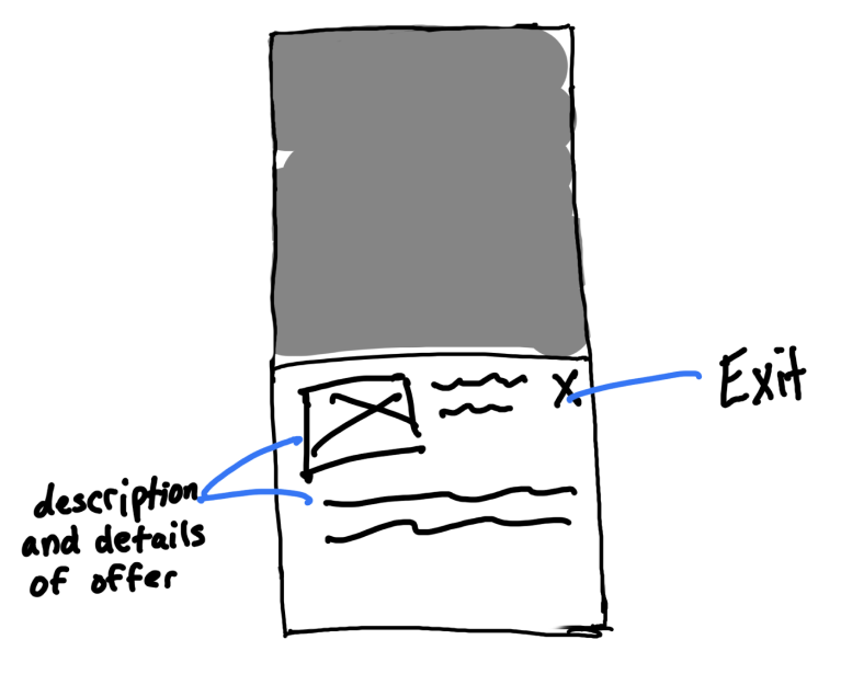
Expansion modal of a particular offer, which offers more in-depth details
From here, all of the necessary pieces were in place to make this tool viable and I was ready to begin designing higher fidelity mockups in Figma. Another unexpected challenge I ran into was the sizing and resizing of certain brand logos. Knowing that some logos were more square, while others were more linear, I documented for the development team a formula on how the logos should be resized given height and width dimensions.
Usability testing
I utilized UserTesting.com to run usability tests on the Reward feature. While the tool itself tested really well, there was a fair amount of confusion on how Rewards actually works. After deliberation with our product manager, we decided to introduce an onboarding flow that would explain how Rewards works and the benefits it offers.
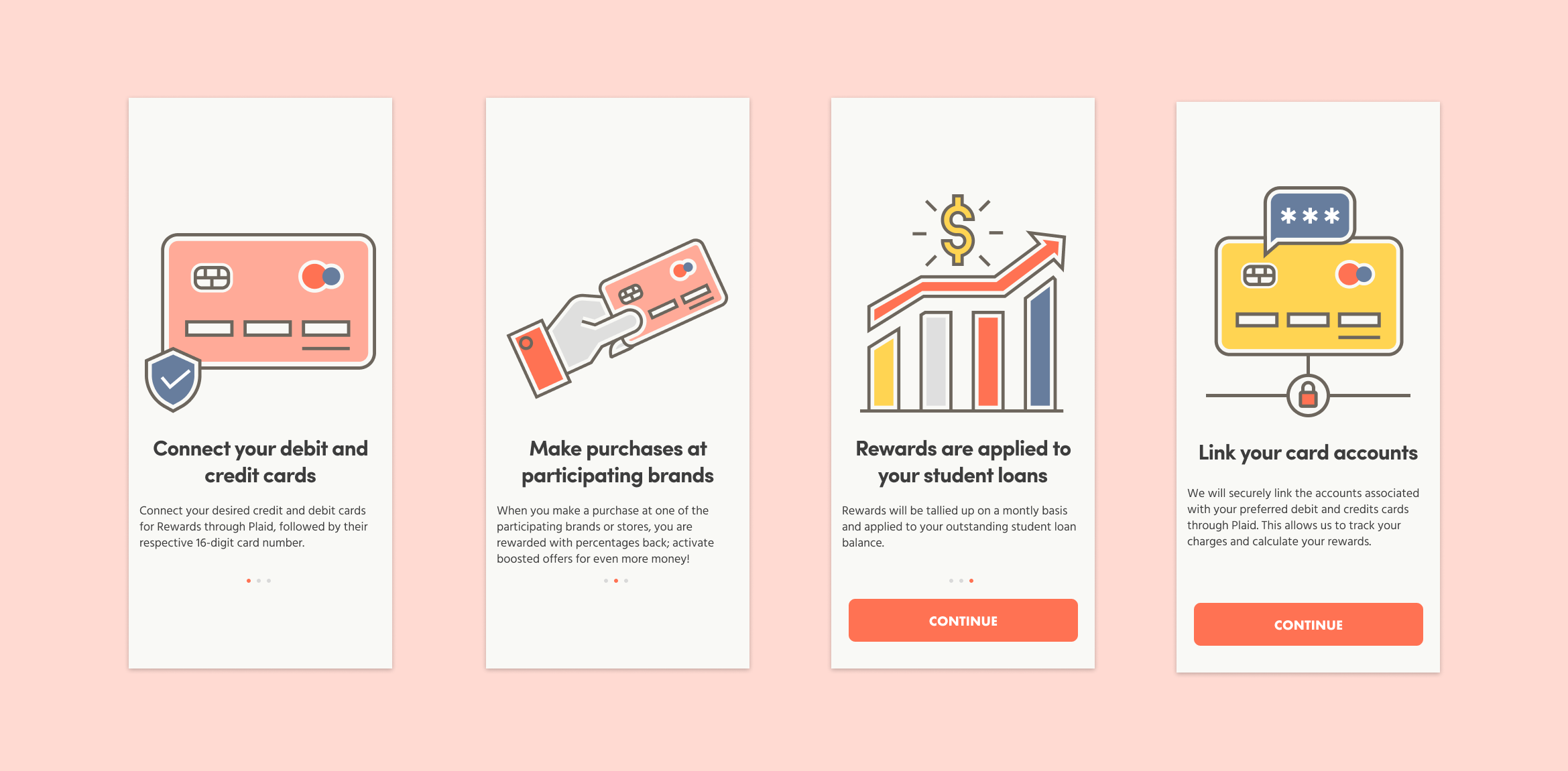
Onboarding flow for Chipper Rewards
Once the onboarding flow was added to the prototype and retested, the results were far more positive and the confusion seemed to be lifted.
Results
The designs were handed off to development in early fall of 2022, and was completed in November of that same year. Since then, we have seen an increase of users who use the product and have shared positive feedback from its use.